You should all know Smoking-Hookah.com by now. I have been ordering from and dealing with this vendor for a while, so you’ve heard their name in my reviews and they are one of our most trusted vendors. Well, they recently updated their website for a more streamlined and stylish experience. I’ve been playing with the site, checking out the new features and it’s time I gave you my assessment.
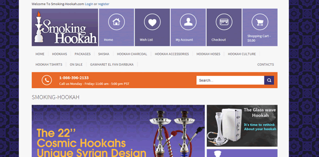
The new layout is really slick. I love the choice of purples and the clean design of the home page. It’s easy to find what product category you want and the front page is covered in bright pictures advertising all of the current deals and freebies. It seems like they are going to be keeping these deals up to date and replacing them regularly. Similarly there are spotlight features on new and interesting products that I like because I don’t enjoy digging through a site to find what’s new.
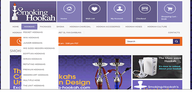
They still have the same wide assortment of products and all of them are grouped into categories. These are easily accessed through the new drop-down menus. Instead of having to click through a web of pages to get to the category you want or, worse yet having only one page that contains every hookah, the drop down menus let you easily find the page you want and get there in one click.
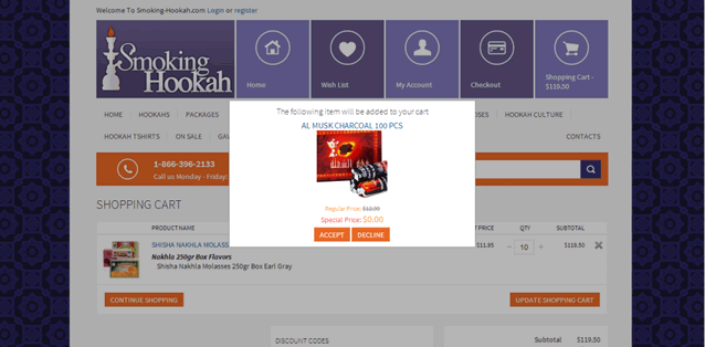
One feature that I really loved was the freebie alert. This activates when your cart meets certain requirements (usually a certain cash value before shipping) and it pops up in your cart to as if you would like to add the free item to your order. I like having the option to choose if I want to take the freebie and I like that you can activate deals you didn’t even know existed. I don’t really like the freebie itself, but that has nothing to do with the new website.
After all my searching and experimenting I finally found something that I didn’t like about the new design. There is a product comparison tool that lets you take two or more product and display all of their attributes and descriptions side by side. It’s a great feature that is most useful for hookahs, but I found this one to be poorly planned and executed. I added two hookahs to my comparison list, but then had no idea how to view said list. After much searching I was able to find the comparison tool under my profile page. This placement was difficult to figure out and the actual comparison didn’t tell me much that wasn’t already on each hookah’s page. It’s nice to have the stats right next to each other, but this was mostly the standard description and very little technical info.
All in all, I like the new design a lot. It is classy and easy to navigate, which are both huge selling points for me. I suggest checking out the new site and some of their new features to get a feel for yourself. I’m pretty sure you wont be disappointed with what you see.